Fogos (Fires)
- Project name
- Software
Fogos (Fires)
AXURE RP
1 . Context
In Portugal, forest fires are a recurring threat, especially during the summer months when weather conditions are more favorable for the ignition and spread of fires. These fires affect not only the safety and well-being of communities but also cause significant environmental and economic damage. The Portuguese population relies on up-to-date information to monitor fire situations, understand risks, and make informed decisions to protect themselves and their property. However, until now, access to centralized information on fires—such as location, risk, and mobilized resources—has been limited.
2. Problem Definition
The Portuguese population lacks a practical and accessible source of information that allows them to monitor active and extinguished fires in their municipality and other regions of the country in a centralized, real-time manner. Furthermore, there is a need for easy access to data on mobilized firefighting resources, risk forecasts, and impact statistics. The absence of a unified tool providing these critical details makes it harder for citizens to understand the current fire situation and adopt necessary preventive measures, putting their safety at risk and increasing the vulnerability of communities.
3. Objective
The objective of the Fogos application is to provide an intuitive, centralized platform where the public can access real-time information on fires in Portugal. The app enables citizens to monitor active and extinguished fires in different regions, view mobilized firefighting resources, track fire risk forecasts, and consult statistics and affected areas. Developed based on data from the National Authority for Civil Protection, the app aims to facilitate access to critical information and support quick, informed decision-making, promoting safety and risk prevention.
4. Heuristic Evaluation
Objective: To evaluate the usability of the Fogos.pt website and the mobile app (iOS), focusing on identifying issues that hinder users’ access to critical information essential for ecosystem protection and citizen safety.
- Confusing Information and Excessive Detail;
- Interface Layout and Organization;
- Lack of Clarity and Accuracy in Information;
- Unsatisfactory User Experience.
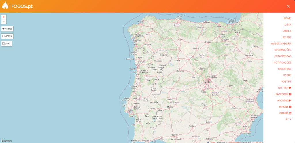
The heuristic evaluation of Fogos.pt revealed significant areas for improvement, particularly regarding information clarity, visual organization, and navigability. By applying these insights to the redesign of the Civil Protection website, the aim is to deliver a more intuitive and user-friendly experience, making civil protection information more accessible and beneficial for preserving the well-being and safety of all users.
4.1 Personas

5. Solution Proposal
5.1 User Stories
Active Fires List View
- As a user, I want to see a list of active fires, including information about the fire status, district/municipality, date/time, and confirmation by Civil Protection, so I can avoid going to affected areas and find safe alternatives.
Fire Map
- As a user, I want to view a map showing active fires with details about the fire status, district/municipality, date/time, and confirmation by Civil Protection, so I can stay informed and avoid dangerous areas.
Application Support and FAQs
- As a user, I want to be able to ask questions within the application to fully understand how to use all its features.
Report a Fire
- As a user, I want to be able to report a fire I spot to help prevent its spread and cooperate with Civil Protection.
Civil Protection Alerts
- As a user, I want to see alerts issued by Civil Protection for the current day, to stay informed and protected.
Notification Settings
- As a user, I want to set notifications on my phone to receive real-time updates on active fires, so I can stay informed at all times.
Recent Fire Statistics
- As a user, I want to view statistics on recent fires and incidents, to understand the history and frequency of fires in my area.
Location Filter
- As a user, I want to be able to filter fire locations to view incidents in different municipalities or districts, so I can adjust the information to my needs.
Fire Risk Forecast
- As a user, I want to see the fire risk forecast for the next 7 days by municipality, to anticipate potential dangers and make informed decisions.
Additional Information (News and Roads)
- As a user, I want to access additional information, such as news on fires, road closures, and alternative routes, so I can travel safely and avoid risky areas.
Functional Application for Civil Protection Technicians
- As a Civil Protection technician, I want a functional and up-to-date application that allows users to access fire locations and relevant information efficiently, without malfunctions.
5.2 Use Cases
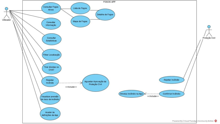
To detail the use of the application, a use case diagram was created, which describes the main functionalities of the system and their interaction with the users:
5.3 Application Map
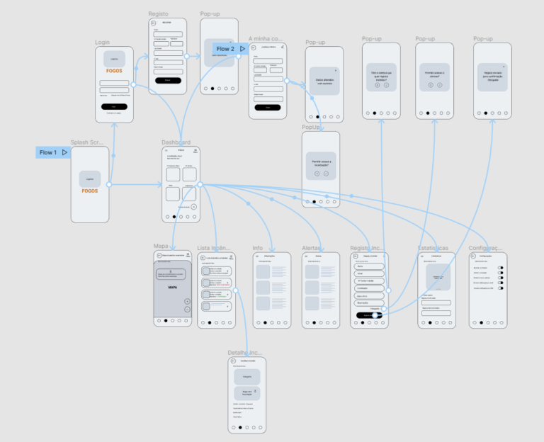
Based on the existing website and the improvements to be made, the general application map was developed, detailing the navigation structure and key functionalities, ensuring an intuitive and efficient experience for all types of users:

5.4 Storyboard
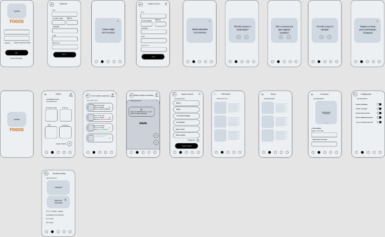
To facilitate prototyping, and to be able to conceptualize, architect the prototype, and preview each of the screens, a storyboard was created:
6. Validation
6.1 Usability Testing
Participants
Tests were conducted with 8 participants, 5 of whom were female and 3 male, aged between 18 and 30 years. The average age of the participants was 24.8 years, with a standard deviation of 4.6.
Materials
Given the pandemic context due to COVID-19, the tests were conducted remotely. However, the following resources were used for the tests:
Confidentiality Statement: This document was sent remotely to each user so that they could authorize the sharing of their data provided during the tests between the students and the course professors.
Task Guide: A set of instructions for the users to follow in order to understand their interaction with the application.
Example:
Task 1: Indicate the number of active fires
This task aims to test the usability of the Dashboard, specifically whether the information is presented in an accessible manner.
The task is completed when the user provides the respective number.Task 2: Indicate the municipalities where the active fires are located
Continuing from the previous task, this also aims to test the usability of the Dashboard, specifically whether the information is presented in an accessible manner.
The task is completed when the user provides the respective names.Task 3: Register a fire
The goal of this task is to test the functionality of the registration button. The user should register a fire by filling out a form with the following details: Person’s name, location, date and time of registration, observations (optional), and photo (optional).
The task is completed when a “registration successful” message appears.
Observation Grid: A document filled out while the participants performed their respective tasks.
Satisfaction Questionnaire: This questionnaire aims to gather information about the user’s experience with the application. It was adapted from the model provided in the theoretical lessons, and included questions about clarity of vocabulary, font size, colors, etc.
Emotion and Cognitive Effort Scale: This questionnaire aims to assess the emotional and mental state of the users while using the application. Questions like the level of mental effort required to use the app and how they felt during the process were included.
7. Solution
7.1 UI Prints

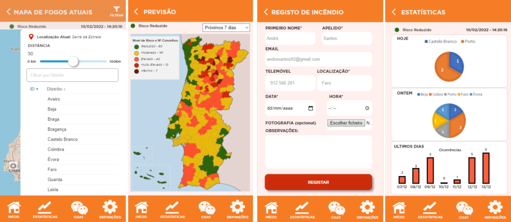

7.3 Main Features
- Home Screen
- Shows the user’s current location and the fire risk level in the area.
- Includes a “+” button to add or report a new incident.
- Provides a view of nearby active fires and a fire risk forecast.
Current Fires Map
- Displays an interactive map showing the locations of active fires in Portugal.
- Option to adjust the search distance and view specific details by district.
- Allows users to view a detailed list of nearby fires.
Fire List
- Presents a list of current fires with details such as:
- Fire status (e.g., “Confirmed” or “Pending Confirmation”).
- Type of fire (residential, forest, etc.), location, and last update.
- Each incident has a brief description and associated photos.
- Presents a list of current fires with details such as:
Fire Details
- Shows detailed information about a specific fire, including:
- Exact location on the map.
- Alert status and type of fire.
- Date, time, and additional observations about the incident.
- Shows detailed information about a specific fire, including:
Fire Forecast
- Provides a map view of Portugal with different fire risk levels (green, yellow, orange, red).
- Allows users to select the forecast period (e.g., next 7 days) and view risk levels by municipality.
Fire Reporting
- A form for users to report a fire.
- Includes fields such as first name, last name, location, date, time, and options to add a photo and observations.
Statistics
- Displays charts of fire occurrences by date and location.
- Shows the distribution and frequency of fires over different periods, helping users visualize risk trends.
Settings
- Notification customization options:
- Receive notifications via app, SMS, or email.
- Permissions for location and camera access.
- Notification customization options:
Support Chat
- A direct channel for users to contact the app’s technical support team.
- Allows users to send messages to ask questions or resolve issues, with a simple chat interface.
7.2 Colors & Fonts

8. Results
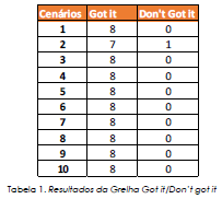
In Table 1, the results of the tasks performed by the participants are presented, according to the established task guide. It was found that, regarding Task 2, one participant was unable to complete the task, resulting in a success rate of 97.5%. All other tasks achieved a 100% success rate.
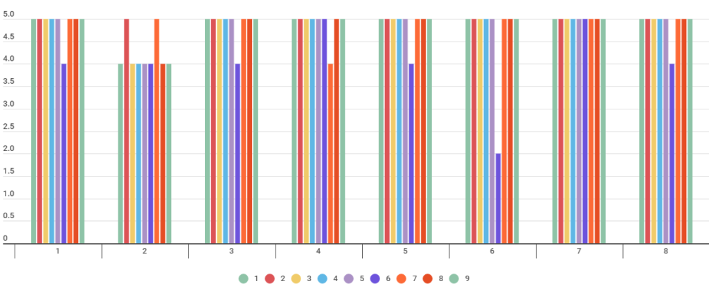
In Graph 1, the results of the satisfaction surveys are analyzed. Participants expressed that the menus were adequate and easy to understand. The clarity of the vocabulary, as well as the colors and font size, facilitated reading. However, one of the criticisms raised was the difficulty in returning to the previous screen. The average score of the survey was 4.79, with a standard deviation of 0.37, which is considered very positive.
When asked about the likelihood of using the application again, only 62.5% stated that they would definitely use it again. Regarding the overall evaluation of the application, 87.5% of participants rated it as excellent. It is worth noting that 50% of the participants had advanced experience in using applications (as illustrated in Graph 2).

9. Conclusion
The prototype is considered an excellent option based on the improvements made to the existing application and the results obtained from various users. The overall user experience, as previously mentioned, is positive.
Significant improvements were made, especially in the functionality of the return button and adjustments for differences across browsers, such as displaying the number of firefighters involved in the fire response.
The requirements were met, although the sample size could have been more diverse. However, due to the pandemic, I believe the sample used was sufficient to generate conclusive results.